Why Your Brand’s First Impression Is Made in 0.05 Seconds — And How to Make It Count
Research consistently shows that people form a judgement about a website within fifty milliseconds. That’s faster than a blink. In that fraction of a moment, your audience has already decided whether your brand feels trustworthy, professional, and worth their time — or not.
At YNB, this is something we think about constantly. Not because we’re obsessed with speed, but because we understand that first impressions are visual long before they become verbal. A potential customer will absorb your colour palette, your typography, the quality of your imagery, and the overall feeling of your visual presence before they read a single word of copy. This is why visual identity isn’t decoration. It’s strategy.
When we develop a brand’s visual identity, we begin with questions that might seem far removed from design: Who is your audience? What do they value? What emotional response do you want to provoke? What does trust look like in your specific market? The answers to these questions shape everything that follows — from the weight of a typeface to the mood of a product photograph.
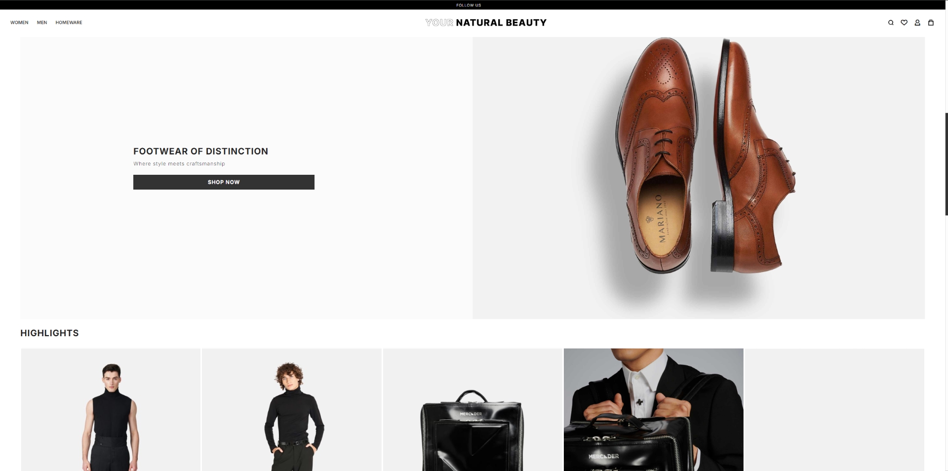
Consider the difference between a luxury footwear brand and a technology startup. Both need to communicate quality and professionalism, but the visual language is entirely different. For a brand like Campobello Shoes, the visual identity needs to evoke craftsmanship, heritage, and understated elegance. The photography must capture texture and detail. The colour palette must feel warm and grounded. Every visual element must whisper rather than shout. For a technology platform, the signals shift: clarity, innovation, accessibility. The same principle — visual identity as strategic communication — but expressed through a completely different vocabulary.
This is precisely why generic design fails. When a brand uses stock imagery, template layouts, and borrowed visual conventions, it might look acceptable in isolation. But it says nothing. It creates no memory. It builds no emotional connection. And in a market where consumers are exposed to thousands of brand messages daily, saying nothing is the same as being invisible.
The most effective visual identities share three qualities. First, they are distinctive — not merely different for the sake of difference, but recognisably themselves. When you see them across any touchpoint, from a business card to a billboard to an Instagram story, you know immediately who is speaking. Second, they are consistent. Every visual expression reinforces the same core message, building recognition and trust over time. Third, they are authentic. They reflect something true about the brand rather than following whatever trend happens to dominate the moment.
Building this kind of visual identity requires more than graphic design skill. It requires the ability to listen deeply to what a brand truly is, the strategic thinking to translate that understanding into visual decisions, and the discipline to maintain coherence across every medium and format. It also requires high-quality visual production — because even the most thoughtful identity concept falls apart if the photography is mediocre, the colour reproduction is inconsistent, or the digital implementation is clumsy.
This is why, at YNB, we approach visual identity as a multidisciplinary practice. Our designers, photographers, and developers work together from the earliest stages of a project, ensuring that every element — from the logo to the website to the social media content — is part of a single, unified visual story.
Your brand’s first impression happens in a fraction of a second. Make sure it tells the truth about who you are.